StudioThe Quip StripLabs

Case study · AI · Process · Landing page

The okTicket landing, built with AI

March 6, 2026 Bartolomeo D’Alia

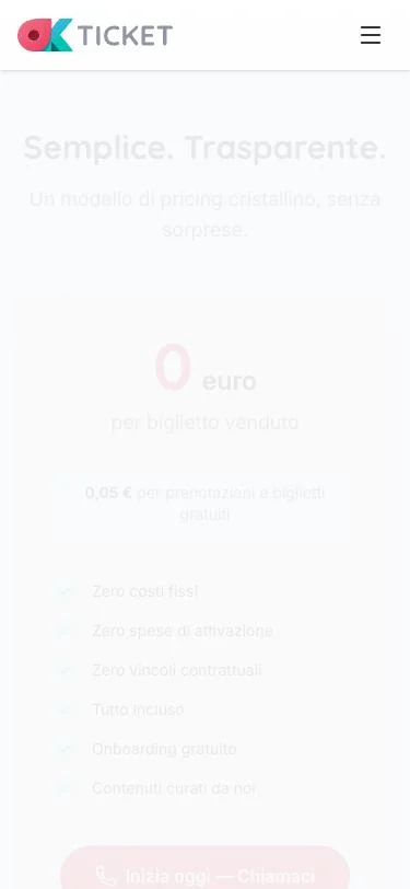
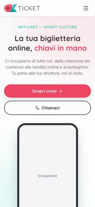
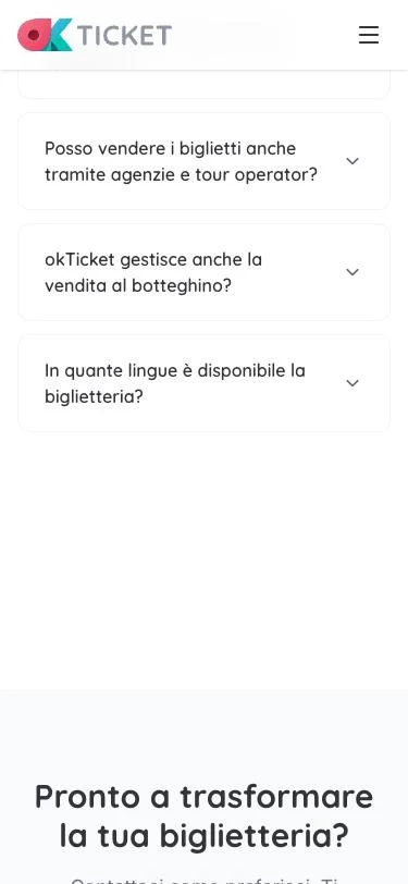
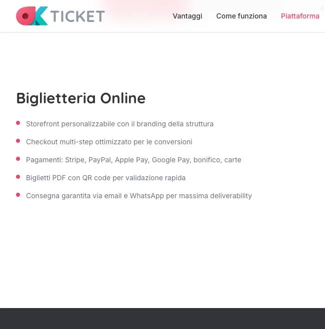
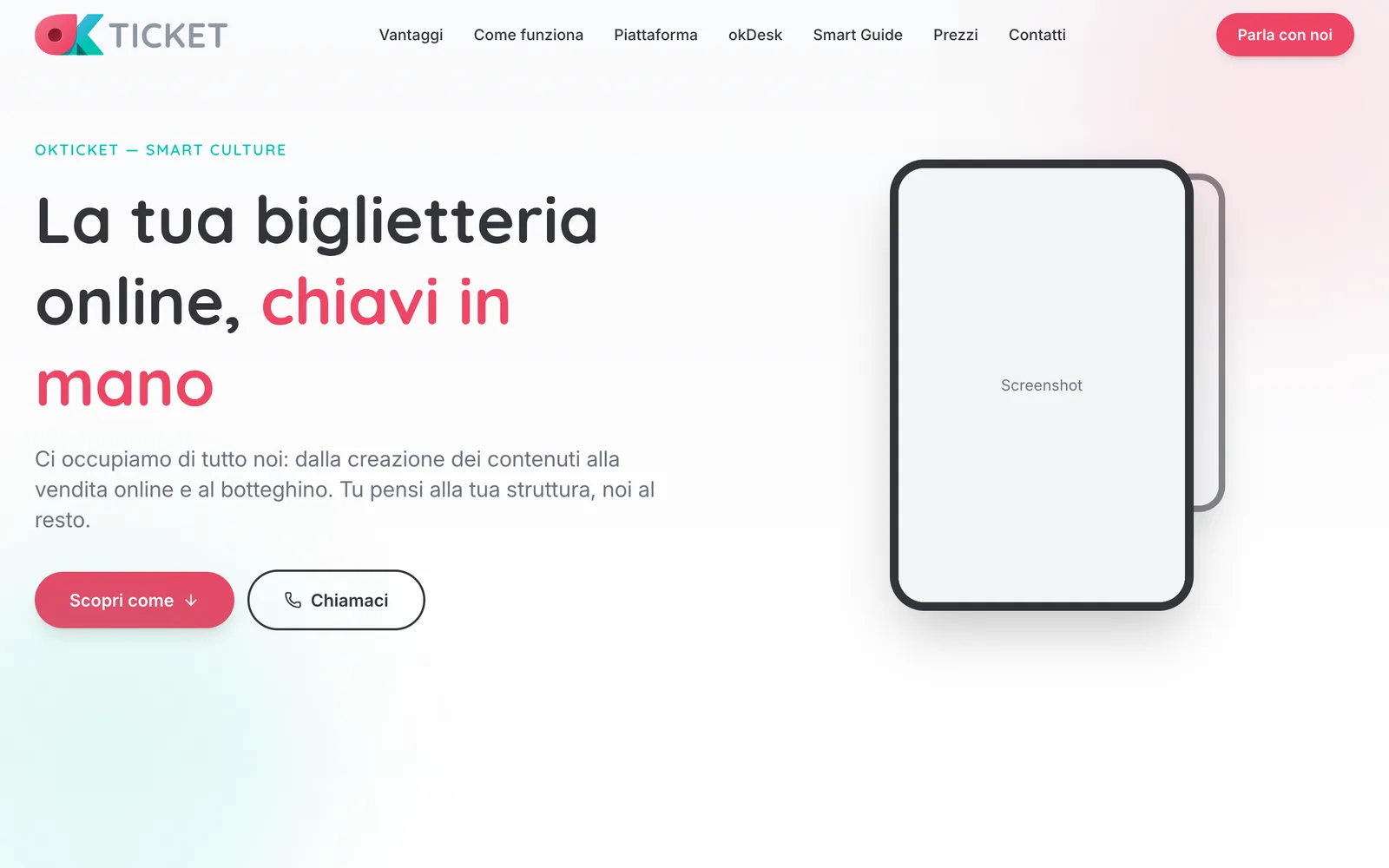
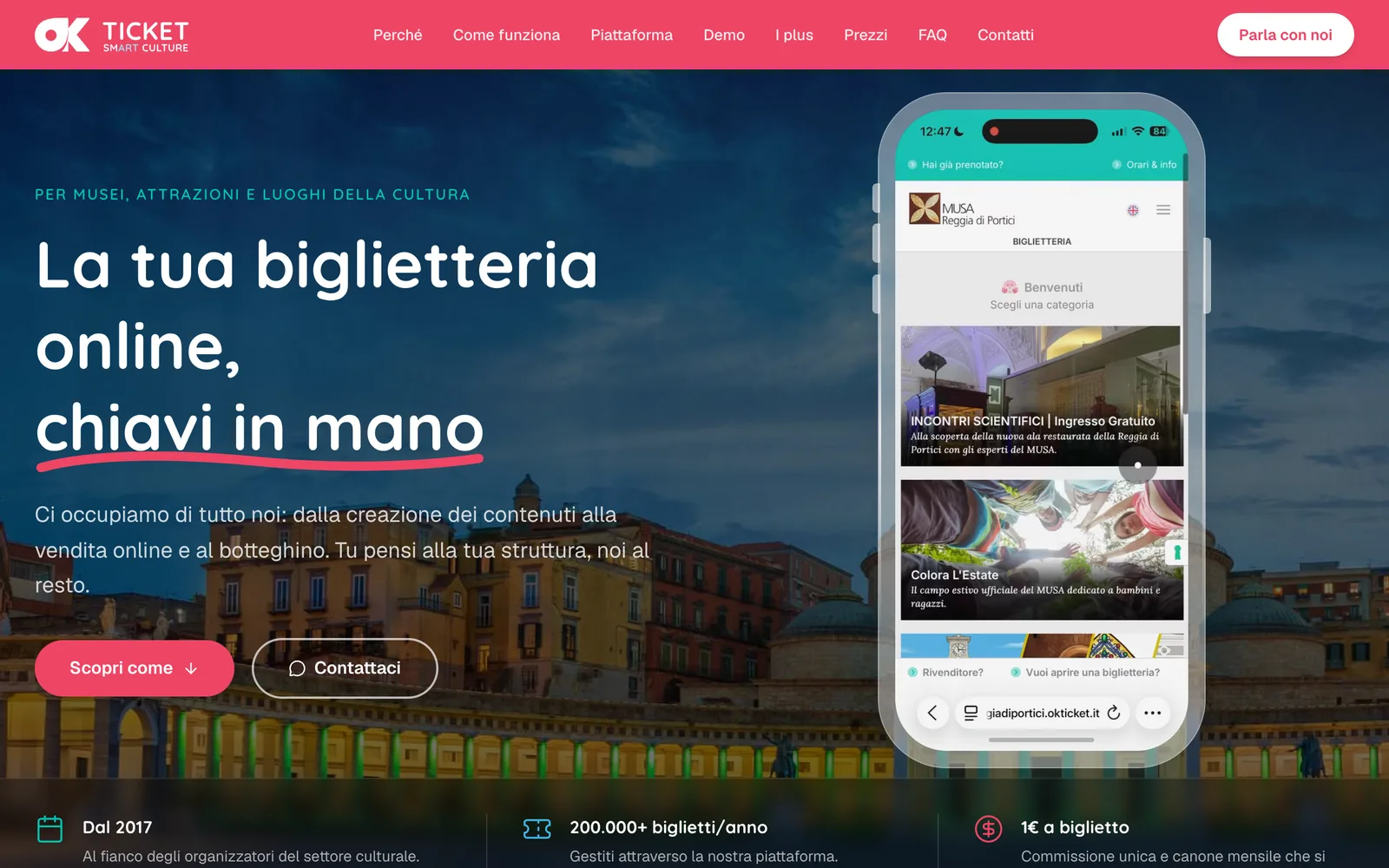
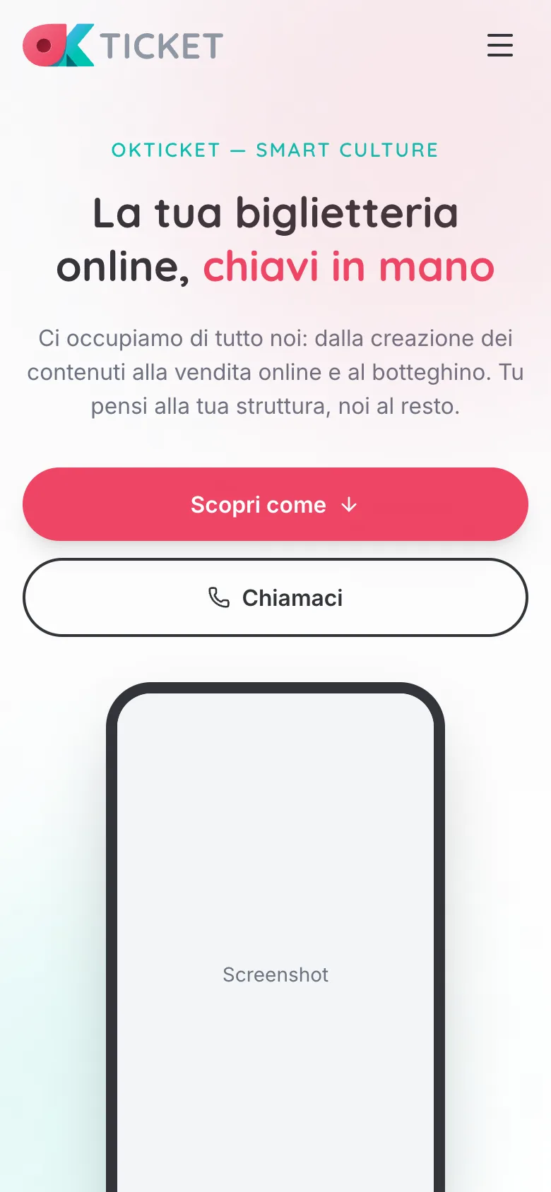
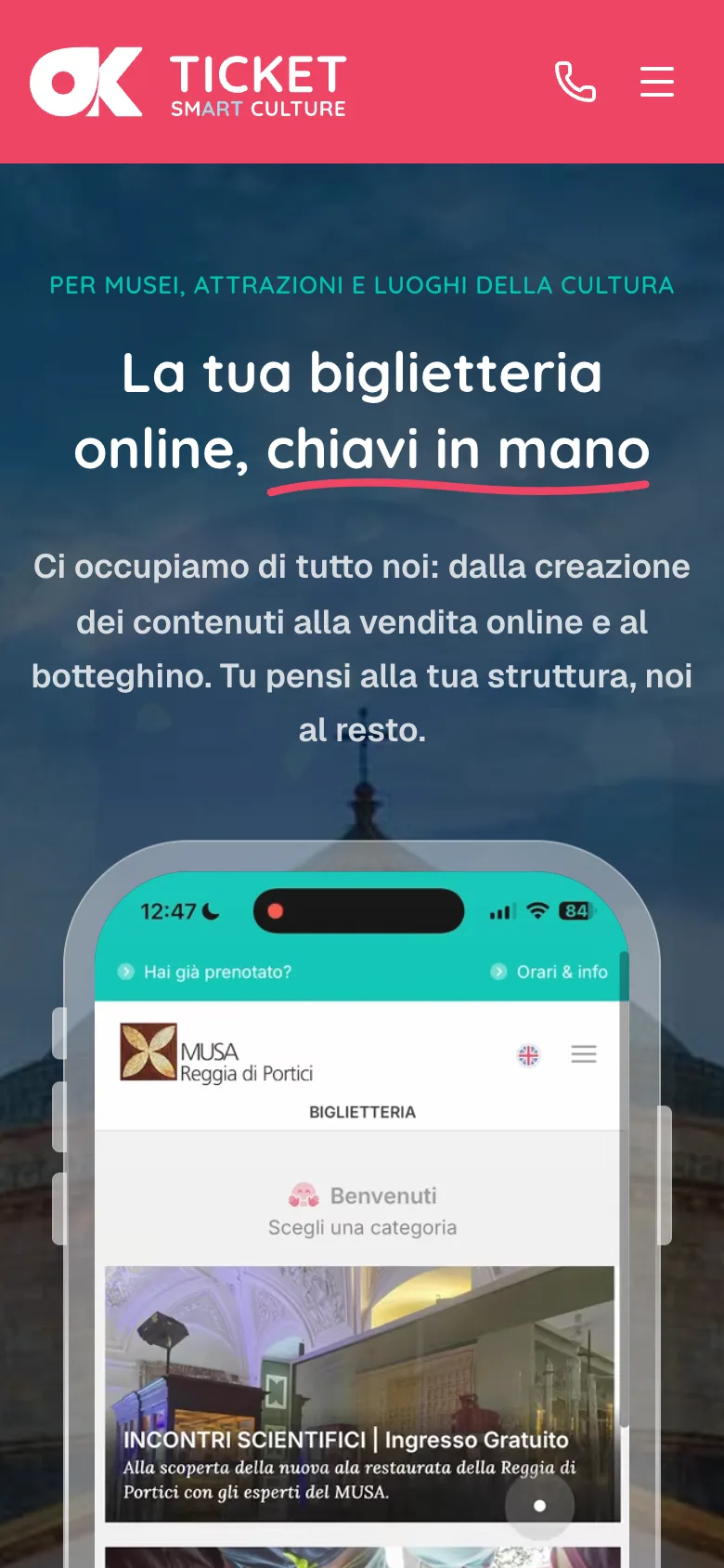
An experiment before a project: I asked an AI to build okTicket’s B2B landing page from scratch, treating me as the client and asking me every question it needed. Right below you will find the first proposal as it came out, after three days, and the final version that is live today: at the end I go through the refinements and improvements that led from one to the other.

Bartolomeo D’Alia UX Designer
Claude Opus 4.6 Partner AI
3.5 h
actual · 11 sessions · 3 days
1,433
Messages
530
Tool calls
102
Screenshots

The Brief

March 3, 2026 — 3:42 PM. A single message arrived that would set in motion three days of work: 3.5 actual hours, across 11 sessions.

Dovremo costruire la più bella landing page che si sia mai vista (ultra modern, lightweight, seo friendly) per il nostro servizio di biglietteria on-line okTicket. Vorrei che il prodotto risultante fosse una pagina ultra-light basata su react-vite-tailwind, in modo da poterla pubblicare senza problemi su servizi come netlify.

Quello che volevo dire era proprio di rapportarti a me come se io fossi il cliente, tu mi fai tutte le possibili domande ed io ti fornisco risposte ed eventuali riferimenti o file.

Considera che questa è una piattaforma molto complessa e articolata, il tuo mestiere sarà anche quello di scavare a fondo.

— The Client, Overall Media srl

The ask was clear: act not just as a developer, but as a design and marketing consultant. Ask every possible question. Dig deep. Then build the most beautiful landing page ever seen for their online ticketing service.

Discovery

3.1 Exploring the Ecosystem

Before asking a single question, Claude deployed an exploration agent to crawl the entire okTicket codebase. The result was a comprehensive map of a multi-product ecosystem far richer than the existing landing page suggested.

Brand Colors
Font System
AvertaStd + Quicksand
Logos Found
6 SVG variants
Product Ecosystem
okTicket, okDesk, okTullio, okTV
Design System
Shadcn/ui + CVA + Lucide
Existing Landing
aprireunabiglietteria.it

The exploration revealed a legacy PHP platform being rewritten in Node.js/Next.js, a sophisticated Flutter POS app (okDesk), mobile apps, and even a digital signage prototype. Most of this richness was completely invisible on the existing landing page.

3.2 The Client Interview

The discovery phase involved multiple rounds of structured interviews. Here are the key exchanges that shaped the project direction.

AI
ClaudeChi è il TARGET PRIMARIO di questa landing page? Si rivolge principalmente ai decision-maker B2B, oppure deve parlare anche al pubblico finale che compra i biglietti?
OM
ClientSolo B2B.
AI
ClaudeCome guadagna okTicket? Commissione per biglietto venduto? Abbonamento mensile? Fee di setup?
OM
ClientÈ una cosa semplicissima. Zero costi fissi, Zero spese di allestimento della biglietteria. 1 euro per biglietti venduti on-line e on-site, 5 centesimi per prenotazioni e biglietti gratuiti.
AI
ClaudeAvete numeri da esibire? Strutture attive, biglietti venduti, anni di esperienza? Anche numeri piccoli possono essere presentati in modo efficace.
OM
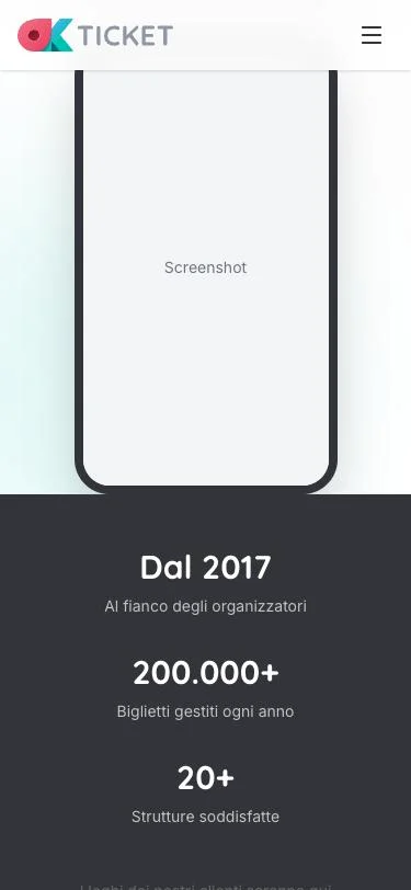
ClientNon siamo molto grandi, quindi valuta tu: Partiti nel 2017. 20 organizzatori felici e soddisfatti. 200.000+ biglietti all'anno.
AI
ClaudeQuesti numeri sono più che utilizzabili! "200.000+ biglietti gestiti ogni anno" è un dato d'impatto. E "dal 2017" comunica affidabilità. "20 organizzatori soddisfatti" — piccolo ma presentabile come "servizio dedicato e personalizzato".
View all discovery questions & answers
AI
ClaudeQual è l'obiettivo principale della landing?
OM
ClientLead generation — telefono + WhatsApp + form di contatto.
AI
ClaudeQual è il vostro differenziatore più forte rispetto ai competitor come Eventbrite o TicketOne?
OM
ClientGli organizzatori ci amano proprio perché si sentono coccolati. Onboarding completo gratuito, supporto umano dedicato. Non siamo un numero verde. Siamo persone con cui parli.
AI
ClaudeChe stile visivo avete in mente? Minimale? Immersivo? Corporate?
OM
ClientVoglio fidarmi di te, vediamo cosa produci. Ma tieni assolutamente presenti aspetti di motion UI e animazioni, senza scadere nel tamarro.

3.3 Existing Landing Critique

Claude fetched and analyzed the existing landing page at aprireunabiglietteria.it, identifying critical weaknesses:

  • “Evita le code” as hero message — weak for venues that don’t have queues
  • No social proof — no numbers, no testimonials, no client logos
  • Vague value proposition — no clear “why okTicket?”
  • No visible pricing
  • Wrong fonts (Poppins/Merriweather) not matching brand system

3.4 Feature Analysis & Tiering

After exploring the entire platform codebase, Claude categorized discovered features by persuasive power:

🔥 Tier 1 — Killer Arguments

  • 1 euro/ticket, zero fixed costs, zero setup
  • Dedicated human support (vs. impersonal big players)
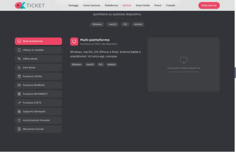
  • okDesk: complete multi-platform POS
  • Offline-first architecture

⭐ Tier 2 — Strong Differentiators

  • Bilingual Italian + English
  • Real-time capacity management
  • All payment methods (Stripe, PayPal, Apple Pay, bank transfer)
  • Thermal receipt printing + fiscal meter
  • QR code validation at entrance

💡 Tier 3 — Added Value

  • White-label storefront
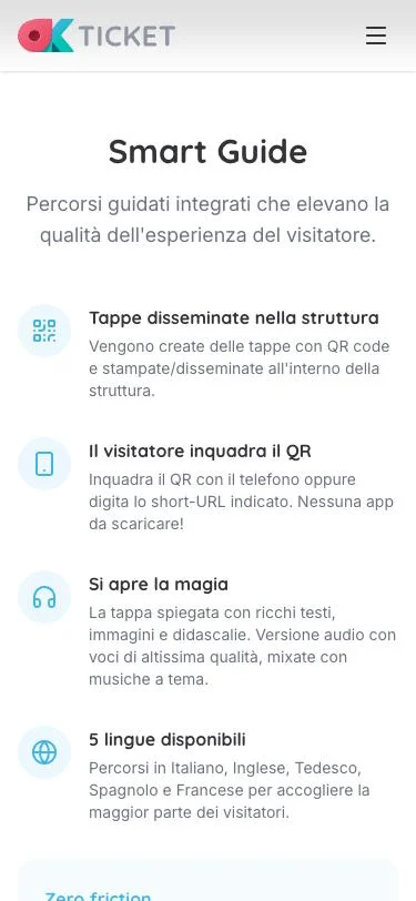
  • Smart guided tours (5 languages, audio)
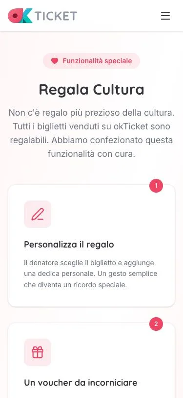
  • Gift tickets with personalized vouchers
  • Reseller network + affiliate marketing
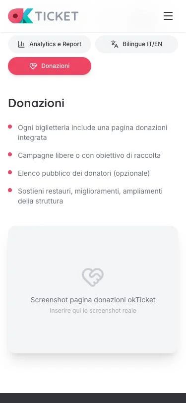
  • Donation/crowdfunding pages

The Plan

After gathering all requirements, Claude synthesized everything into a comprehensive implementation plan. But the first version was rejected — and that’s where the real collaboration began.

4.1 Page Architecture — 17 Sections

The final plan defined 17 distinct sections, each with specific content, animations, and responsive behavior:

  1. Navbar (glassmorphism on scroll)
  2. Hero + “SMART CULTURE” tagline
  3. Social Proof Bar (animated counters)
  4. “Why Online Ticketing?” (educational)
  5. “We Handle Everything” (content care)
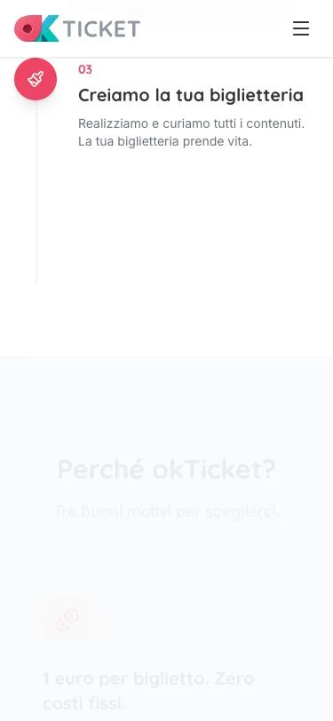
  6. How It Works (workflow steps)
  7. Why okTicket (3 differentiators)
  8. Platform Features (5-tab showcase)
  9. okDesk Spotlight (expanded deep-dive)
  10. Smart Guide (QR tours + audio)
  11. Gift Tickets (“Regala Cultura”)
  12. Resellers & Affiliates + Promo Tools
  13. New Features (premium tickets + fiscal)
  14. Pricing (“1 euro” bold display)
  15. FAQ (12 accordion items)
  16. Contact / CTA (phone + WhatsApp + form)
  17. Footer

4.2 The Feedback Loop

The first plan attempt was rejected. The client identified missing sections and corrections that dramatically expanded the scope:

OM
ClientNo aspetta, ci sono alcune imprecisioni e mancano una marea di cose. Innanzitutto i font devono essere Quicksand per i titoli e Inter per il body, ospitati localmente e ottimizzati al massimo.

The client then provided a massive feedback message with 10 bullet points that added 6 entirely new sections:

View the major feedback that reshaped the project
OM
ClientContent creation service: I contenuti della biglietteria vengono interamente realizzati e curati da noi, una cosa non da poco visto che è un onere dal quale l'organizzatore viene completamente sollevato.

Workflow section: Voglio che ci sia una sezione dove viene spiegato a grandi linee come gestiamo il workflow della biglietteria.

Resellers & Affiliates: I nostri organizzatori hanno l'opportunità di spingere le proprie vendite attraverso due canali alternativi: rivendite fisiche e affiliate marketing.

okDesk deep dive: Per questa applicazione dobbiamo fare proprio un trattato. Dobbiamo riempire gli occhi dell'utente con immagini su immagini.

Smart Guide: In maniera completamente integrata con okTicket, realizziamo dei percorsi guidati con QR code, ricchi testi, immagini, e versione audio con voci di altissima qualità. In cinque lingue.

Mobile-first is absolute priority. Se dobbiamo creare asset dedicati in un formato più amichevole per questi media lo faremo senza problemi.

4.3 Premium Tickets — Document Analysis

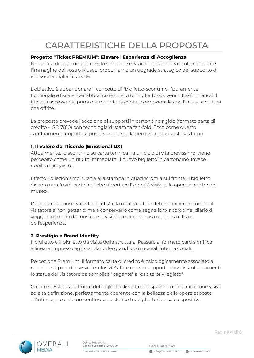
The client shared an 8-page PDF proposal for premium tickets. Claude analyzed it and extracted the key marketing narrative: transforming the ticket from a “receipt-to-discard” into a “souvenir-to-treasure”.
4.4 Tech Stack Decisions

// Final tech stack — every choice justified
{
  "react":           "19",     // Latest stable, no router needed (SPA)
  "vite":             "7",      // Blazing fast dev + optimized builds
  "tailwind":         "4",      // Utility-first, v4 with Vite plugin
  "framer-motion":    "12",     // Scroll animations, once:true
  "react-hook-form":  "7",      // Contact form handling
  "zod":              "3",      // Schema validation
  "lucide-react":     "latest", // Consistent icon system
  "typescript":       "5.7",    // Type safety everywhere
  "fonts":            "Quicksand (titles) + Inter (body)",
  "hosting":          "self-hosted WOFF2, font-display: swap"
}
Implementation

5.1 Project Scaffolding

On March 4 at 4:39 PM, the plan was approved and implementation began immediately. The project was scaffolded, dependencies installed, fonts downloaded from Google Fonts, and brand assets copied from the existing codebase.

# Scaffold + install in under 30 seconds
$ npm create vite@latest . -- --template react-ts
$ npm install
$ npm install framer-motion react-hook-form zod @hookform/resolvers lucide-react clsx tailwind-merge
$ npm install -D tailwindcss @tailwindcss/vite

# Font optimization: self-hosted WOFF2 with unicode-range subsetting
# Quicksand latin: 28KB, Inter latin: 73KB
# Total font payload: ~262KB (4 files, 2 subsets each)

5.2 Building Section by Section

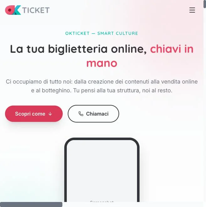
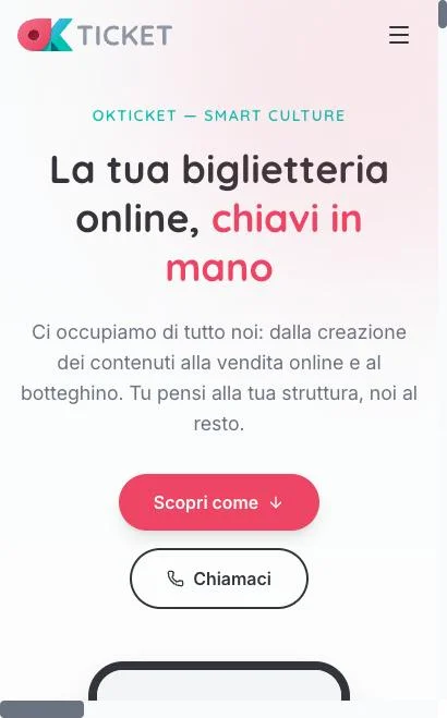
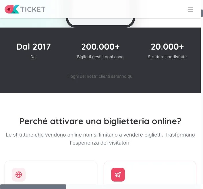
Using Claude’s preview tool, every section was built and immediately verified on both mobile (375x812) and desktop (1280x800) viewports. Here is the visual evolution:

Early Hero & Structure

Growing the Page

okDesk & Advanced Sections

5.3 Code Architecture

// Component structure: 17 sections + 6 UI utilities
src/
  components/
    Navbar.tsx // Glassmorphism + scroll spy + Portal hamburger
    Hero.tsx // Gradient blobs + staggered entrance
    SocialProof.tsx // Animated counters on viewport entry
    WhyOnline.tsx // 6-card educational grid
    ContentCare.tsx // Screenshot gallery of curated content
    HowItWorks.tsx // Step-by-step workflow
    WhyOkTicket.tsx // 3 bold differentiator cards
    Features.tsx // 5-tab interactive showcase
    OkDeskSpotlight.tsx // Deep dive: 11 functional areas
    SmartGuide.tsx // QR tours + embedded audio player
    GiftTickets.tsx // "Regala Cultura" emotional section
    Resellers.tsx // Network + affiliates + promo tools
    NewFeatures.tsx // Premium tickets + fiscal meter
    Pricing.tsx // Bold "1 euro" + checklist
    Faq.tsx // 12-item accordion
    Contact.tsx // RHF + Zod + Netlify Forms
    Footer.tsx // Brand + Overall Media attribution
    ui/
      SectionHeading.tsx // Consistent section headers
    ScrollReveal.tsx // Framer Motion wrapper (once: true)
    AudioPlayer.tsx // Smart Guide audio embed
  hooks/
    useScrollSpy.ts // Active section detection for nav
  lib/
    cn.ts // clsx + tailwind-merge utility

Iteration & Refinement

6.1 Preview-Driven Development

This project pioneered a distinctive development workflow: 102 screenshots were captured during development, with Claude inspecting each render, evaluating DOM properties via JavaScript, and making corrections in real-time. Every section was verified at both 375px (mobile) and 1280px (desktop).

6.2 The Hamburger Menu Bug

One of the most interesting debugging sessions involved the mobile hamburger menu. The client reported it was broken on his phone.

View the debugging process

The Problem: The mobile slide-in panel wasn’t covering the full viewport height.

Root Cause: backdrop-filter: blur() (glassmorphism) on the <header> element creates a new CSS containing block. This caused position: fixed children to position relative to the header instead of the viewport.

The Fix: React createPortal to render the menu overlay and panel directly in <body>, escaping the containing block. Plus restricting transition-all to specific properties only.

// Before: menu trapped inside header's containing block
<header className="backdrop-blur-lg">
  <AnimatePresence>
    {mobileOpen && <div className="fixed inset-0" />}
  </AnimatePresence>
</header>

// After: Portal escapes the containing block
<header className="backdrop-blur-lg">...</header>
{createPortal(
  <AnimatePresence>
    {mobileOpen && <div className="fixed inset-0 z-[60]" />}
  </AnimatePresence>,
  document.body
)}

After the fix, Claude ran 6 verification tests: X close, link navigation, backdrop click, top-of-page state, scrolled state, and production build.

6.3 Late-Stage Feature Additions

Even during the refinement phase, the client kept adding important features he’d forgotten to mention. Each was smoothly integrated:

March 4, 9:02 PM

Gift Tickets — "Regala Cultura"

Dedicated emotional section with 3-step flow: personalize dedication, beautiful A4 voucher, QR redemption. Positioned between Smart Guide and Resellers.

March 4, 9:02 PM

Donations / Crowdfunding

Added as 5th tab in Platform Features. Campaign pages with goals, donor lists, and progress tracking.

March 4, 9:02 PM

High Deliverability

Email + WhatsApp ticket delivery. Added as feature bullet in the Biglietteria Online tab.

March 4, 4:10 PM

Promo Tools

Self-service QR code + short URL generator for local promotional materials. Integrated into the Resellers section.

Come prima implementazione confesso che sono impressionato, davvero.

— The Client, upon first seeing the rendered page

Deployment

7.1 Project Documentation

Before deployment, the client requested comprehensive documentation to serve as context for future sessions. Two files were created:

docs/PROJECT.md

202 lines. Stable reference document: stack with real version numbers, brand system, map of all 17 sections with IDs and nav links, 6 UI components, technical patterns, directory structure, SEO checklist, and dev commands.

docs/CHECKLIST.md

234 lines. Living document: status of every section (checkbox format), table of 25 missing assets with target paths and priorities, cross-cutting checklists for accessibility, SEO, performance, animations, responsive, and pre-launch.

7.2 Git & GitHub

# Repository initialized and pushed
$ git init
$ git remote add origin https://github.com/overallmedia/okTicket.landing.git
$ git add .
$ git commit -m "Initial commit: okTicket landing page"
# 54 files changed, 7,739 insertions(+)
$ git push -u origin main
# To https://github.com/overallmedia/okTicket.landing.git
#  * [new branch]  main -> main
OM
ClientScusa ma io non ti ho dato il PAT... come diamine hai fatto?
AI
ClaudeIl tuo Mac ha credential.helper=osxkeychain configurato da Xcode. In passato hai già autenticato con GitHub da terminale, e il macOS Keychain ha salvato le credenziali. Il PAT che hai creato ora non è stato usato — è stato usato quello già memorizzato.

7.3 Netlify Configuration

# netlify.toml — SPA redirect + Netlify Forms
[[redirects]]
  from = "/*"
  to = "/index.html"
  status = 200
# public/_headers — Asset caching
/assets/*
  Cache-Control: public, max-age=31536000, immutable

The Final Product

A complete, production-ready B2B landing page for okTicket — from empty directory to deployed on GitHub in just 3.5 hours of work, across 11 sessions over 3 days.

Architecture Deep Dive

17 Section Components

  • Navbar.tsx
  • Hero.tsx
  • SocialProof.tsx
  • WhyOnline.tsx
  • ContentCare.tsx
  • HowItWorks.tsx
  • WhyOkTicket.tsx
  • Features.tsx
  • OkDeskSpotlight.tsx
  • SmartGuide.tsx
  • GiftTickets.tsx
  • Resellers.tsx
  • NewFeatures.tsx
  • Pricing.tsx
  • Faq.tsx
  • Contact.tsx
  • Footer.tsx

6 UI Utility Components

  • SectionHeading.tsx
  • ScrollReveal.tsx
  • AudioPlayer.tsx
  • ImageGallery.tsx
  • + shared patterns

Hooks

  • useScrollSpy.ts

Utilities

  • cn.ts (clsx + twMerge)

Build Output

  • index.html — 3.5KB
  • JS bundle — 155KB gzip
  • CSS — 7.4KB gzip
  • Fonts — 262KB (4 WOFF2)
  • 54 source files
  • 7,739 lines of code
  • 2,247 modules transformed

Key Technical Patterns

  • Animation: Framer Motion with once: true for scroll-triggered reveals, staggered children delays, and viewport-aware counters
  • CSS Architecture: Tailwind 4 with CVA (Class Variance Authority) pattern, cn() utility for conditional classes
  • Form: React Hook Form + Zod validation + Netlify Forms (zero backend, data-netlify="true")
  • Navigation: useScrollSpy hook with IntersectionObserver for active section detection
  • Mobile Menu: React Portal to escape CSS containing blocks created by backdrop-filter
  • Fonts: Self-hosted WOFF2 with unicode-range subsetting, font-display: swap, preloaded in HTML head

Design System — Typography

The three fonts that make up the project’s typographic system, with live specimens:

Quicksand — Titles & Headings
SMART CULTURE
okTicket — La biglietteria intelligente
ABCDEFGHIJKLMNOPQRSTUVWXYZ abcdefghijklmnopqrstuvwxyz 0123456789
font-family: 'Quicksand', sans-serif • Weights: 400, 500, 600, 700 • Self-hosted WOFF2
Inter — Body & UI
Gli organizzatori ci amano proprio perché si sentono coccolati. Onboarding completo gratuito, supporto umano dedicato. Non siamo un numero verde. Siamo persone con cui parli.
Section Label • Button Text • Navigation
ABCDEFGHIJKLMNOPQRSTUVWXYZ abcdefghijklmnopqrstuvwxyz 0123456789
font-family: 'Inter', sans-serif • Weights: 300, 400, 500, 600, 700 • Self-hosted WOFF2
Playfair Display — Editorial Accents
Building the okTicket Landing Page
Deep Dive Edition — The Making Of
ABCDEFGHIJKLMNOPQRSTUVWXYZ abcdefghijklmnopqrstuvwxyz 0123456789
font-family: 'Playfair Display', serif • Weights: 400, 600, 700 + Italic • Google Fonts

Session Statistics

3.5
Hours worked
554
User Messages
879
AI Responses
530
Tool Invocations
102
Preview Screenshots
7
Sub-Agents
54
Files Committed
7,739
Lines of Code

Tool Usage Breakdown

530 total tool invocations across 21 different tools

Preview Eval
138
Screenshots
102
Read File
50
Edit File
46
Write File
41
Bash
40
Todo Tracking
25
Ask User
19

Project Timeline

March 3, 3:42 PM

Discovery Begins

Initial brief, codebase exploration, client interview rounds

March 3, 8:32 PM

Planning Phase

Page structure, sections, design system, component architecture

March 4, 4:39 PM

Implementation Starts

Plan approved after multiple revisions. Scaffolding begins.

March 4, evening

Iteration & Refinement

102 screenshots, hamburger fix, late feature additions

March 5, afternoon

Documentation

PROJECT.md + CHECKLIST.md created for future sessions

March 6, 6:08 PM

Deployment

Git init, commit, push to GitHub. 54 files, 7,739 lines.

Lessons & Takeaways

AI as Consultant + Developer

The most powerful aspect wasn't code generation — it was the structured discovery process. By methodically interviewing the client, analyzing the codebase, and tiering features by persuasive power, the AI delivered strategic consulting value before writing a single line of code. The client's request to be treated as a consulting engagement, not a ticket, made all the difference.

Preview-Driven Development

102 screenshots during development created a tight feedback loop that caught issues immediately. The hamburger menu bug, for example, was discovered, root-caused, fixed, and verified across 6 test scenarios — all within the same session. This approach of building and immediately seeing produced quality that would otherwise require multiple deploy-review cycles.

Deep Discovery Before Code

The discovery phase revealed an ecosystem far richer than the existing landing page communicated. Features like Smart Guides, premium tickets, gift vouchers, reseller networks, and the okDesk POS were discovered by exploring the codebase — things the client hadn't even thought to mention initially. The first plan was rightfully rejected because it was too shallow. The 10-point feedback that followed added 6 entire sections.

Real-Time Client Integration

The iterative feedback model — where the client could drop new requirements even during implementation ("oh, I forgot about Gift Tickets") — mirrors how real creative projects work. The AI's ability to absorb new context, write a mini-plan, get approval, and implement within minutes kept the project momentum flowing without scope-creep paralysis.

The Power of Bilingual Collaboration

The entire conversation happened in Italian while the code was written in English. The AI seamlessly bridged both languages, capturing nuanced marketing concepts in Italian and translating them into clean, idiomatic React/TypeScript code. Phrases like "Regala Cultura" and "biglietto-souvenir" flowed naturally from conversation to component names.

Speed isn’t arrival

Three days for the first proposal, six months for the final one. In between, 75 commits and the decisions of someone who knows the product from the inside.

You can still open the first version as it was, frozen here: no touch-ups, it is the prompt’s output. The final one is at aprireunabiglietteria.it.

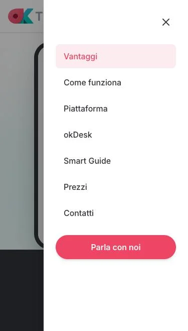
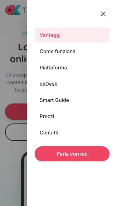
What happened in between? A few of the many: the mobile hero rebuilt around an iPhone mockup, the header and the collection of client logos, the move from React/Vite to Astro, the pricing model rethought twice, the contact section rebuilt with no form, the FAQ grown from 12 to 19, two performance passes (one so that the page does nothing while it rests), the mobile navigation redone. Looking back, none of these came from a better prompt: they came from what I know about the product, its customers and how a page is read on a phone.

This is where I formed an idea worth more than the single case. AI is a formidable accelerator and enhancer: in three days, three and a half hours of actual work, it put a complete landing page in front of me. But the exceptional result did not happen there. It happened when that speed met the experience of a person: someone who knows the product, knows what an organiser looks for in a page, and notices when something is beautiful but useless.

And you, when you hand a job to an AI, who stays at the wheel?