Even big companies can make glaring mistakes in UX design. Let's explore the risks of skipping Defensive UX, analysing real cases and sketching out practical solutions.
In the world of digital products, Defensive UX is a very simple concept that already defines itself in its own words:
Defensive User Experience
In practice, a design approach that aims to protect users from possible errors or accidental choices, guiding them through interfaces engineered to minimise the chance of incidents.
A practice that is part of the broader discipline of Defensive Design, which extends into the physical world too. Undoubtedly a way of designing suggested by plain common sense. And here, once again, I have to acknowledge how extraordinarily intuitive the discipline of UX Design is: no company would ever dream of not wanting to protect its users from possible mishaps, right?
And yet, no…
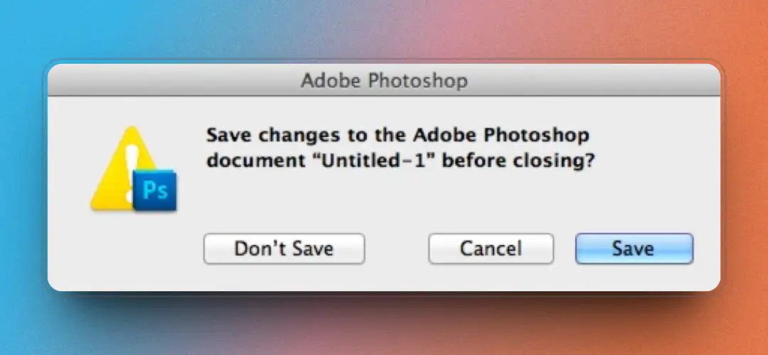
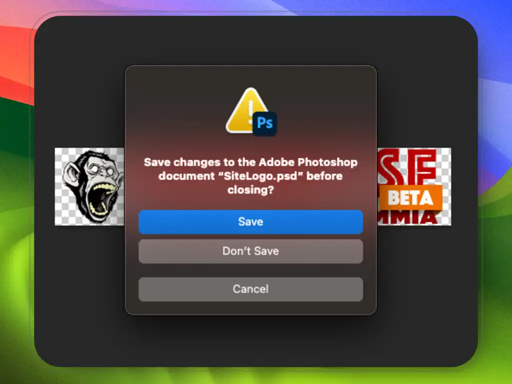
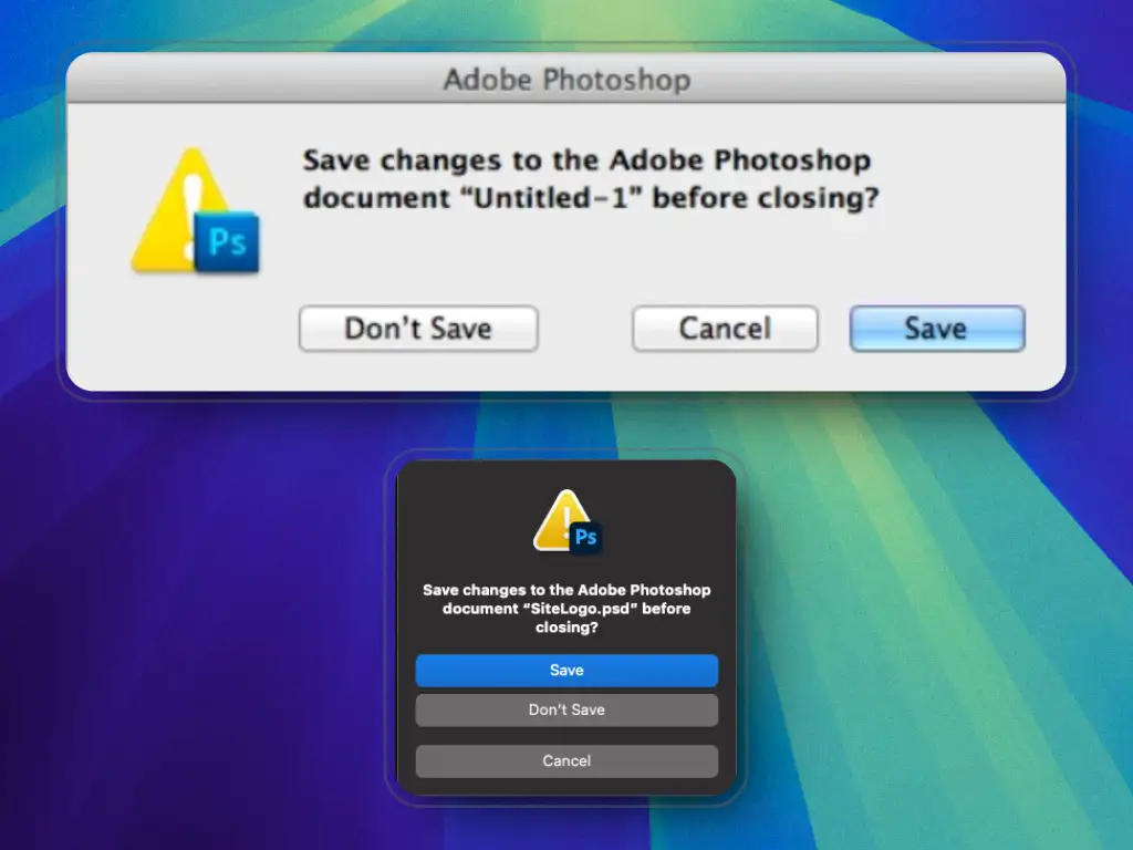
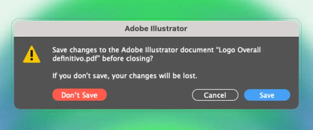
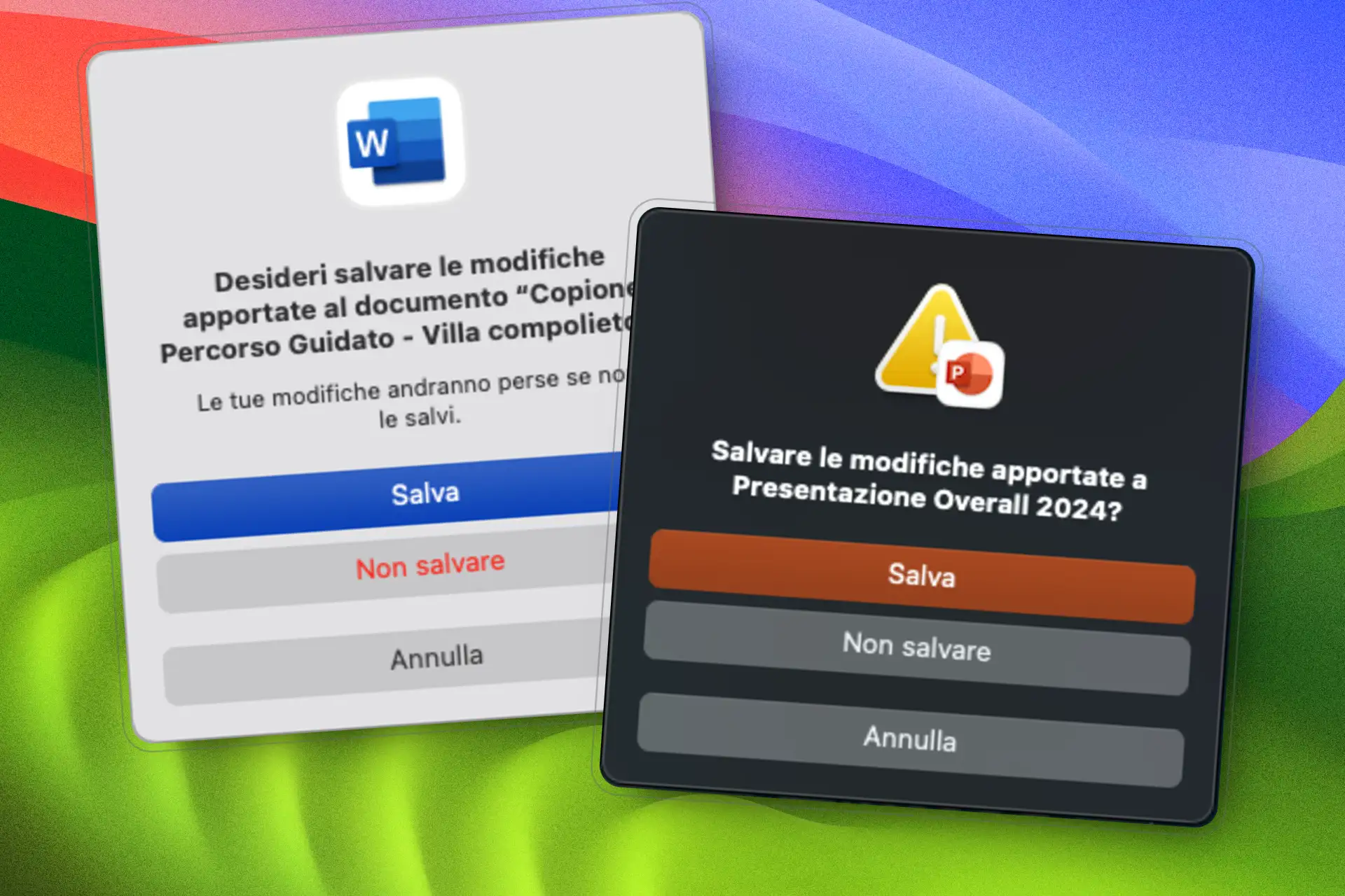
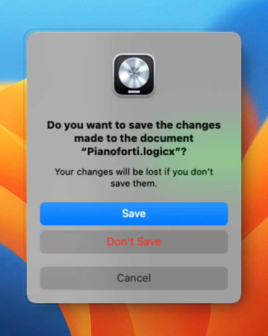
It's incredible to discover that sometimes even very large companies can make blunders that end up giving users a few headaches. And I'm not talking about some fly-by-night outfit. I'm referring to companies like Apple and Adobe — big companies with UX Design in their DNA.
I'm going to tell you how the mix of choices made by these two players led to the worsening of one of the most important "crossroads" dialogs inside productivity applications.
Speaking of Defensive UX, this is perhaps one of the most fitting examples of all — not to mention it's as old as the world itself. I'm talking about something like this:
If you think there isn't much to say about this kind of interaction, you're wrong. I want to analyse it thoroughly with you: it will help us better understand the incident I'm about to describe.
It must protect users from accidentally losing their work in case they forgot to save their changes — when quitting the application or performing any action that could close the file.
By now we can say these dialogs are fairly consolidated, and they always present these three actions:
The most common action, which saves our work. We can classify this action as non-destructive.
The least common action, which discards all the changes made to our file, losing all the work done up to that moment. We classify this action as destructive.
Takes no action at all. Neither the file nor the application is closed, and the user can carry on working. It's a 100% non-destructive action.
There is no public statistic, at least as far as I know, on how users' choices are distributed for this kind of dialog. With a bit of common sense, let's make a few assumptions and try to establish how likely each one is to be chosen:
(*) With a few exceptions: for instance, if the user actually wants to discard their changes, Save becomes destructive and Don't Save becomes non-destructive.
After a few considerations, let's try to jot down some guidelines to apply when designing an interaction of this kind.
The dialog must clearly describe what is happening, using plain wording that leaves no room for ambiguity.
We must somehow tell the user that the dialog requires attention. We could do this with a clearly visible icon.
Saving is the most common action, so its button must clearly communicate to the user that it's the default choice. On a standard macOS dialog, for instance, this button would be blue.
Not saving is the least common action and also the most dangerous one: chosen accidentally, it would cost the user their work. Here, a red button could convey a sense of danger to the user.
Cancelling is rarely used and has no harmful effects. We could communicate it visually with neutral colours, far less prominent than those tied to the two main actions.
Not only is it good practice to make the two primary choices clearly distinguishable — we must also take every possible precaution so that the risk of an accidental choice is reduced to a minimum.
Although this guideline goes beyond the scope of this article, it would be good practice to find a way to defend the user after an accidental choice: which concerns not only failing to save one's work, but also not wanting to save it at all. A user might take the wrong path out of distraction, but also because of an unclear interface.
Now that we have defined a few guidelines, let's see how a save dialog should look:
Let's put this mini-prototype under the magnifying glass:
Now that we've seen good Defensive UX practice applied to a save dialog, let's see what happened out in the real world.
It's certainly no state secret that for a few years now Apple has been converging the design of its operating systems more and more, with a clear lean towards the mobile ones. All of this so that a visual consistency is perceived across all of its operating systems, to the user's benefit.
Release after release, I've watched macOS slowly transform and acquire many elements from its cousins iPadOS and iOS. Among all the components borrowed from the mobile world we find choice dialogs — which include save dialogs. An adaptation I've always found a bit forced.
In a mobile context these interactions make sense, because they're optimised for limited space. But when you move to the desktop world they lose their meaning — unless the goal is merely to keep visual consistency with mobile systems while sacrificing functionality. Does it really make sense, with all the space available on desktops, to organise everything into vertically stacked "silos"?
Let's pick a company at random: Adobe. Let's see how it implemented this new layout in one of its flagship products — none other than Photoshop. Behold this new creature, and let's analyse it:
As you can see, we find practically all the classic elements of this dialog, with the new layout developing vertically.
Let's briefly compare the old world and the new:
Have you already noticed something odd? Let's make a few observations:
Now that we've made these observations, let's get to the point. Have you noticed the change in button placement?
Their layout has changed completely: in the old dialog the Save and Don't Save buttons sit at its far ends; in the new dialog the same buttons have been dangerously placed one beneath the other.
And there's an aggravating factor, which is precisely the new vertical layout. To grasp how much of a difference this makes, let's take some measurements:
The distance between Save and Don't Save has been cut to one fifth: from more than 300 pixels to just over 60.
Let's see what happened in the new dialog:
The incredible thing is that they could have at least put the Don't Save button where Cancel sits, gaining a good deal of distance from its counterpart.
I don't know how much you've had to deal with these dialogs. I've found myself in front of them on countless occasions.
You know what happens to me every 50/60 dialogs? Hurry and distraction are nasty beasts, and more than once I've clicked Don't Save or Save by mistake — simply because, with the buttons so close together, there's a small but real chance of not hitting the right one.
Incidents that luckily sometimes did no great harm, but that in some cases cost me hours of work and made me curse and swear at myself and at whoever is responsible for these situations.
And do you want to know how many times I've had the same incident with the old dialogs?
Maybe I've just been lucky, but the statistic is far too skewed in favour of the "old world".
Applying all the reasoning above, let's try to see how the new interaction could have looked.
Much better this way, don't you think?
The forced use of the vertical layout still doesn't fully convince me, but at least we've differentiated the two main actions and, above all, they're well isolated.
That's the beauty of it. This dialog hasn't been rolled out everywhere (and fortunately so, I'd say). Look for instance at the current save dialog of Illustrator:
Here the buttons all sit close together and Don't Save isn't differentiated in any way — but at least the two actions are well apart. Even here, in my opinion, they could have done better: look at this example I mocked up on the fly.
In this post I picked Adobe as the example, but they needn't worry — they're in good company… I ran a few surveys starting from early August 2024, and things aren't any better for the others.
Over at Microsoft we have exactly the same problems. Here are two examples, with Word and PowerPoint:
Here we get consistency in the dialogs' layout — yet they suffer from the same problem described above. And then it's unclear why there are even some changes for the worse in PowerPoint's, like the missing warning subtext "Your changes…" and the text colour of the Don't Save button, which here inexplicably loses its red and flattens down to the same level as the Cancel button.
Same problem with Logic Pro by Apple:
But here at least, as in Word, they made the small effort of colouring the Don't Save button text in red.
Although I've set myself the rule of covering UX design topics mainly in the digital realm, we must not forget that user experience applies to any product — physical ones too. Let's look at a few small examples of Defensive Design in the real world.
In this case we are protecting a specific category of users — the youngest — by complicating the bottle's opening mechanism, and warding off serious accidents in doing so.
Another example of Defensive Design, in the urban/infrastructure realm. Here we defend passengers waiting for their train with an element that is simple and effective to implement:
Remember the old-world connector on the left? It's among the first USB connectors ever brought to market — the USB-A type, to be precise. And how many times did you curse because you systematically never got the right side up on the first try? The internet is full of memes about these connectors, the most famous being the one about their 3 quantum states:
And have you ever broken the connector — or the port — by inserting it the wrong way?
All of this was solved by designing new connectors, an example of which you can see on the right in the photo I showed you above. Apple was the first to introduce a reversible standard in this space for its products, the Lightning connector, promptly followed by the new USB-C standard, which has become the de facto most used. These new connectors, besides being more compact, can be inserted either way without trouble, sparing us the stress and the possible accidents caused by the old ones.
On a device of this kind there's a flood of examples, but I'll mention two. The second one is, to me, a real gem: it was rolled out a few years ago and proves how a tiny change can bring great benefits.
A rudimentary yet effective mechanism: it retracts a card left in the slot for too long, sheltering it from potential wrongdoers. Useful for people with their head in the clouds, like me. I've triggered this mechanism more than once.
Initially, when you requested a withdrawal at an ATM, the banknotes were dispensed first and the card returned afterwards — which in some cases led slightly distracted users to forget the card in the machine (it happened to me twice…).
Well, by simply inverting the return order (card first, banknotes after) they drastically reduced the odds of forgetting the card at the ATM, protecting distracted people like me from this kind of incident.
After this gigantic disquisition you may be wondering whether I've gone mad to even ask myself this question. And yet it's worth asking. I don't think it's very wise to hold on to static thinking in a world that changes at an absurd speed.
Something has been moving for quite a while now, and this kind of interaction is being pushed further and further into a corner by real-time saving.
Apple was among the first to implement this mode with its iWork suite applications, promptly followed by all the online productivity suites offered by both Google and Microsoft.
In my view this new mode is an excellent compromise — but only if it manages to shelter the user from possible incidents, for instance by letting the user roll the modified work back to a previous state, even after accidentally closing the app.
But the old guard will keep resisting. Today there are cases where even thinking about real-time saving is pure madness. Consider Apple itself with its Logic Pro and Final Cut Pro, which manipulate heavy, large-sized assets and keep these traditional dialogs around. Here we should really be talking about design debt towards users — but we'd never hear the end of it…
Sometimes I try hard to understand the dynamics of corporations as much as I can, but then I realise it's a futile exercise. Mine is not a critique of big companies, but the simple acknowledgement of the enormous complexity of these business organisms, whose dynamics remain incomprehensible when seen from the outside.
In the case covered in this post, logic would have suggested that companies like Adobe, Apple and Microsoft should have sufficient resources to pay the utmost attention to the UX of their products. Which, to be fair, largely does happen — and yet we still find these little absurdities, like the ones I caught on the save dialogs.
Sometimes I've even come to think that the reduced use of these dialogs (due to the introduction of real-time saving) may have lowered the attention paid to this kind of interaction, leading to these glaring mistakes.
Can we then write them off as venial sins? Not at all — especially when they're committed by enormous players that have every means not to commit them. In fact, I'll tell you more: small companies, being less complex, are usually very quick at fixing these situations.
What do you think? Have you run into similar problems with other systems or applications?