The Quip StripStudio

Note · UX · Copy · Landing page

Words matter,
and how

June 20, 2026 Bartolomeo D’Alia

A request that landed in our chat made me realise the most important section of the site was telling a story different from the product we actually sell. Here’s how I went back over it.

The first impression

Almost everything is decided in the first few seconds

Even though I’m no marketing expert, experience and common sense have taught me one thing: when a user opens a page, in a handful of seconds they decide whether they’ve understood where we’re headed, or they leave.

Sometimes we fall for the temptation to dazzle them with big, high-impact words. But the question, deep down, is always the same one:

“If we’re selling a product, has the Customer immediately understood what we’re selling?”

We’re talking about a few seconds. And in those seconds we have to nail, in order, three objectives.

1

A clear, unmistakable message

In as few words as possible, ideally.

2

An immediate reinforcement

Even before the user scrolls: promises, features, advantages that confirm the message and invite them to discover the rest.

3

The visual impact

I put it last on purpose: we can build the most beautiful hero in the world, but if the user doesn’t grasp at once, in fact immediately, where we’re going, the effort was for nothing. It’s the point I’m weakest on, the one that tempts me and sometimes pulls me away from the substance.

Here I’m talking about the first two. They’re the ones that, if you miss them, produce the so-called bounce: the user doesn’t catch the message and leaves the page in a flash. With okNapoli I didn’t even get a bounce — I got worse: a client who had read the message and, instead of understanding that we sold integrated tickets to a set of attractions, had mistaken us for a site giving tourist information about Naples.

01 / The anecdote

A request that gave me pause

A few days ago a client writes to us in chat. A normal, polite question. At first I hadn’t clicked, and I even thought he’d landed on the wrong site. Here’s what he was asking:

“Which are the most interesting places to visit in Naples this summer?”

In practice he was asking us for tips on what to see, but okNapoli is not a tourist guide: the places are ones we’ve already picked, up front, and packaged into two integrated tickets (okNapoli 4 and okNapoli 8). That client shouldn’t have had to wonder what to see: the choice, after all, we’d already made for him.

If he asked anyway, it’s because the hero copy let him read it that way. Not a slip of his: it was the page talking in the wrong way.

Objective 1 · The promise

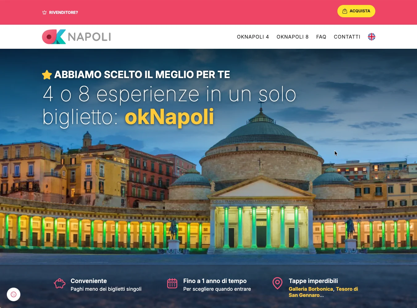
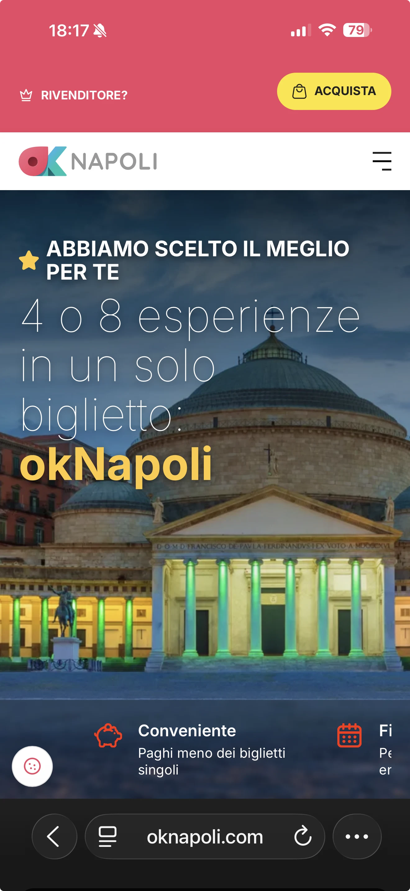
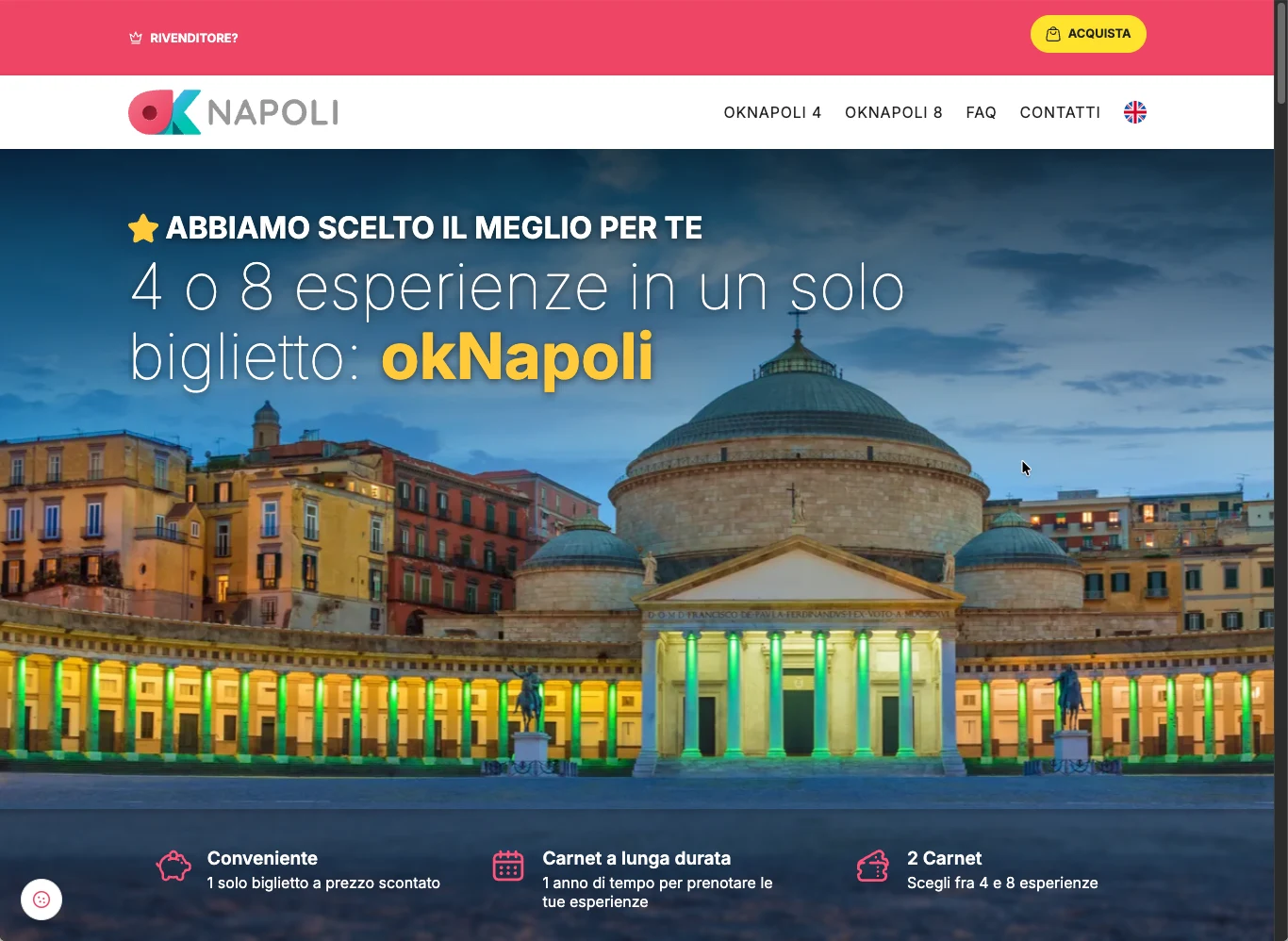
The message you can’t misread

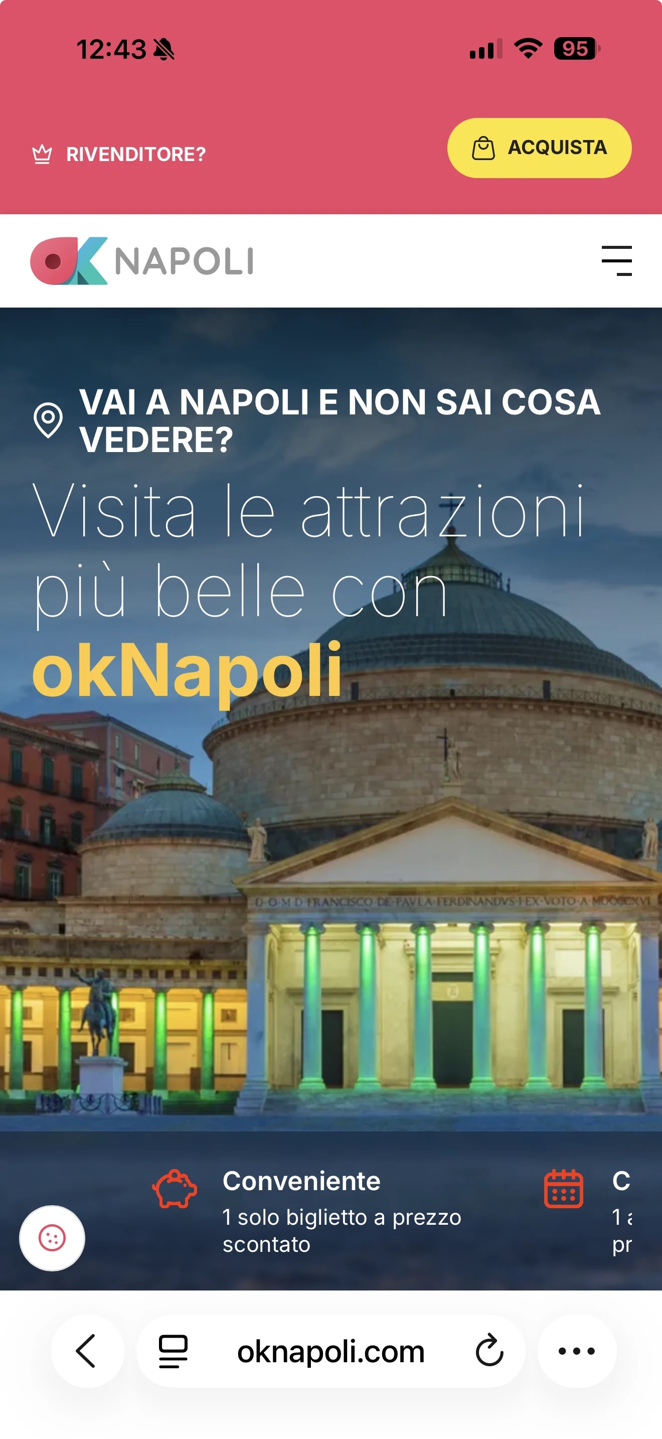
It has to say, in as few words as possible, what we sell, leaving no room for interpretation. Here’s how the hero looked before the change:

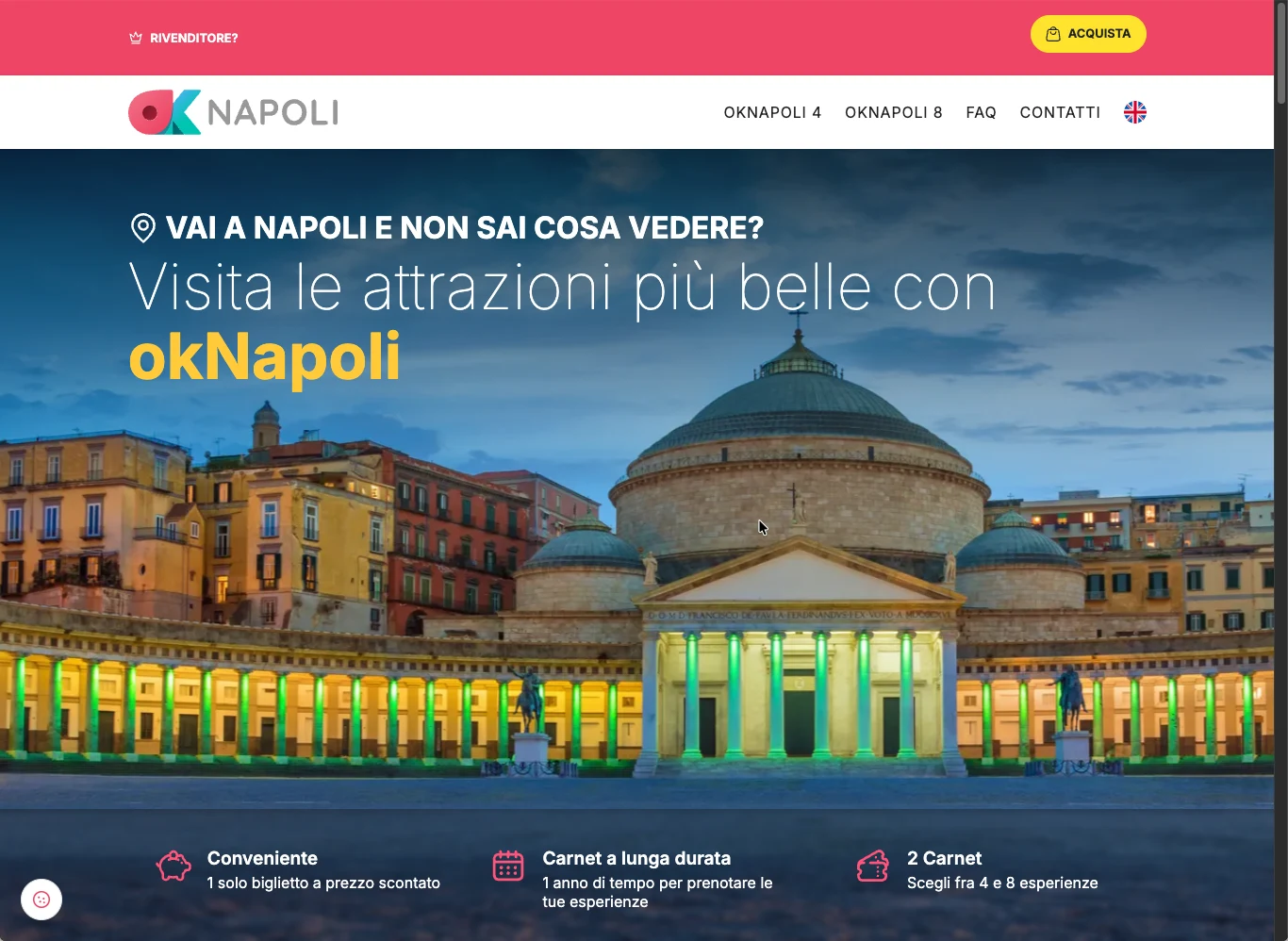
In light of what I’d just realised, here’s my read of it:

1

“Don’t know what to see?”

It cast okNapoli as the one giving advice, not the one who’s already chosen. The ball stayed in the client’s court.

2

“The most beautiful attractions”

It opened an endless field of things to sift through, the opposite of a closed, curated set.

3

The product showed up late

The “4 or 8 experiences” was actually there, but only in the advantages below the hero. A late arrival: by the time the user gets there, the title has already had its say.

Let’s try reworking the copy

I started from the two lines that weigh the most: the eyebrow and the title. Not on the first try, “trip” dragged in too much (flights, hotels), “tour” smelled of a fixed schedule. The right word was the simplest one, “experiences”.

Eyebrow
BeforeGoing to Naples and don’t know what to see?
AfterWe’ve picked the best for you
Title
BeforeVisit the most beautiful attractions with okNapoli
After4 or 8 experiences in a single ticket: okNapoli

Here’s the result:

Now the two lines don’t repeat each other: the eyebrow says who chooses, the title what you get. In as few words as possible, and with no ambiguity.

Three good reasons, before you even scroll

With the message on target, the second objective is to confirm it right away, before the user scrolls. So I also went back over the 3 advantages in the ATF, improving the copy of the first 2 and completely reworking the third:

“1 single ticket at a discounted price”

You pay less than the single tickets

“Discounted” never said compared to what. Now it does.

“1 year to book”

Up to 1 year of time

The old copy promised a year to everyone, but the 4 carnet lasts six months. “Up to” is honest for both.

The third point
“Choose between 4 and 8 experiences”

Galleria Borbonica, Tesoro di San Gennaro…

The hero never said anything about what’s inside. The third point had become redundant: I filled it with two names that are tempting on their own, and that are in both carnets.

Here’s the final result:

How it renders on mobile

Let’s not forget that today mobile is the most-used medium: it’s where most people meet the hero for the first time. Same before and after, on the screen that matters most.

The first impression is the one that counts

I’m often drawn to draw parallels between UX and the real world. And how many times have you heard it said, in all sorts of contexts, that the first impression is the one that counts? One of the greatest truths ever spoken, and one that fully bears out the thesis of this note.

From this experience comes another big lesson too: “user feedback is gold”. We can strain ourselves, pour in every last bit of skill and think we’ve done the best job in the world — then they come along and, right on cue, prove us wrong.

Here’s what I take home, the most important practice and one too often neglected: always ask, in any way and by every means possible, for users’ feedback. Time and again, their “innocent” remarks will help us stay on the right track.

And your site? How does it behave at first impression?